CLIENT:
The Lettuce Agency: properPAK
SERVICE:
NAMING
BRAND & VISUAL IDENTITY
NOTES:
• The Canadian cannabis industry is filled with traditional packaging. The goal was to create a name and brand that emphasised a focus on more sustainable packaging.
• Developed a company and brand statement to clearly define the business's purpose, essentially creating an 'elevator pitch' description.
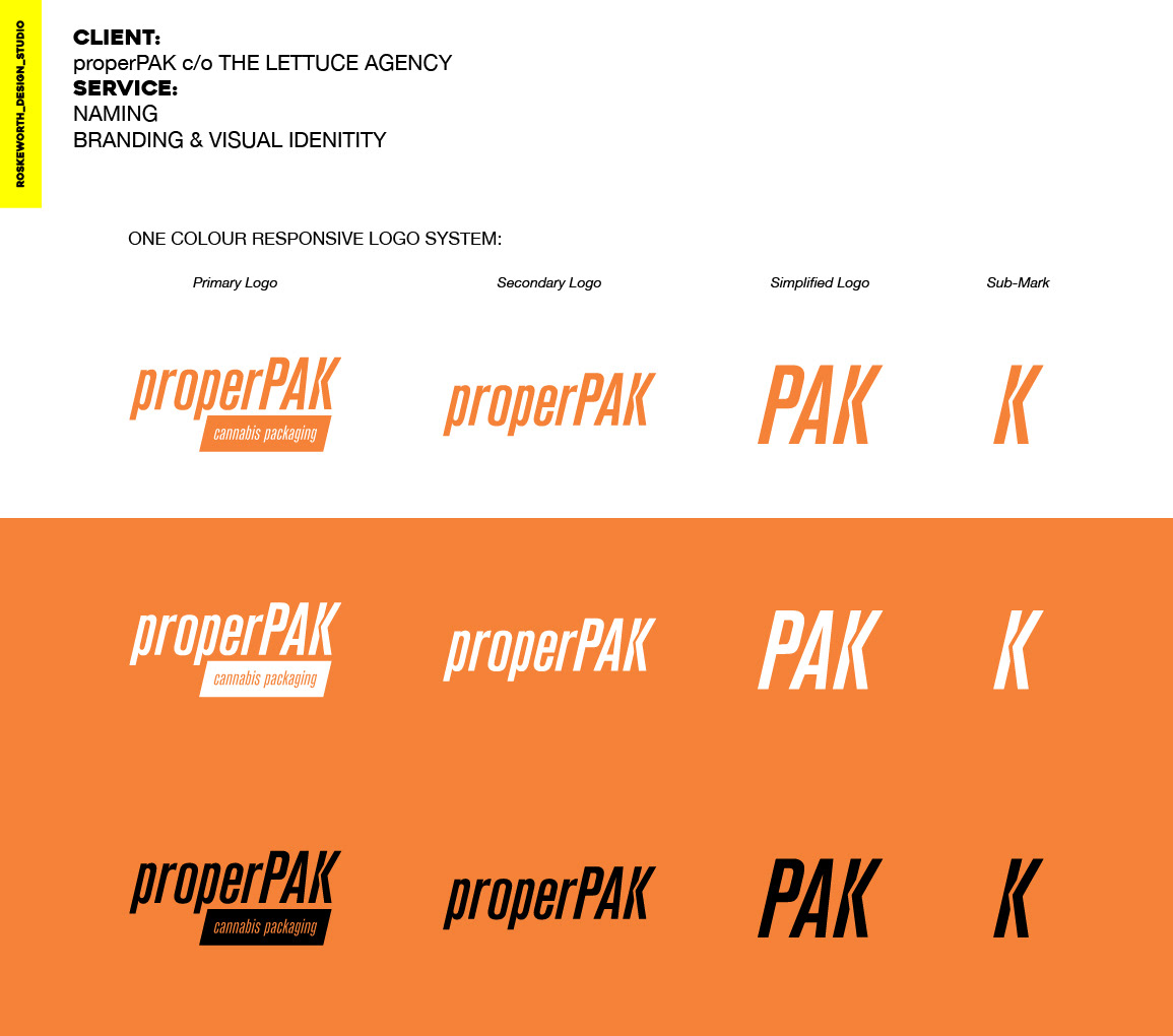
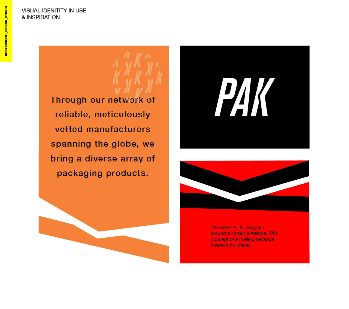
• Designed a fully responsive logo system with a repeating pattern for use on packaging and support materials.
• The letter 'K' is designed around a closed envelope. This concept of a mailing package inspired the brand.
properPAK is a packaging brand that stands out in the Canadian cannabis industry by prioritising sustainability. The name reflects a commitment to providing more eco-friendly packaging solutions, setting the brand apart from traditional options.


